In the Slider component we can enable the advanced tooltip using the showAdvancedTooltip property.
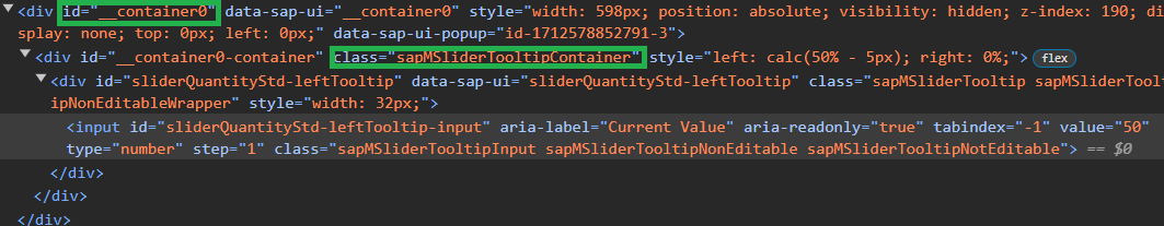
This element can be tricky to inspect with Chrome DevTools (since it disappear when the cursor is not over the slider button). It is also created in a separate div from the sap.m.Slider component, so it can be hard to be selected with CSS.
We could use the specific div id or standard UI5 classes (like sapMSliderTooltip), but is not ideal when multiple Sliders needs to be customized in different ways in the same app.
Today I want to share how to customize a specific sap.m.Slider tooltip element using custom CSS classes.
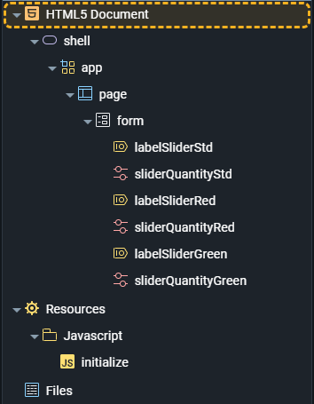
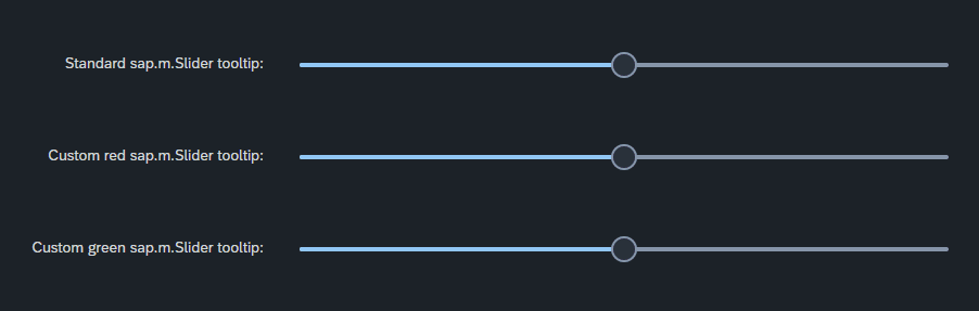
- In my example I created a new form with inside three different Sliders and the showAdvancedTooltip property set to true
- In the initialize Script let's add the custom CSS classes to the tooltips
try {
    sap.ui.getCore().attachInit(function (startParams) {
        sliderQuantityRed.addEventDelegate({
            onAfterRendering: function () {
                if (sliderQuantityRed._oTooltipContainer) {
                    sliderQuantityRed._oTooltipContainer.addStyleClass(
                        "sliderQuantityStyle sliderQuantityRedStyle"
                    );
                }
            },
        });
        sliderQuantityGreen.addEventDelegate({
            onAfterRendering: function () {
                if (sliderQuantityGreen._oTooltipContainer) {
                    sliderQuantityGreen._oTooltipContainer.addStyleClass(
                        "sliderQuantityStyle sliderQuantityGreenStyle"
                    );
                }
            },
        });
    });
} catch (error) {
    console.error(error);
}
- Open now the Stylesheet section and paste the following code
.sliderQuantityStyle .sapMSliderTooltip,
.sliderQuantityStyle .sapMSliderTooltipInput {
    border: none;
    font-weight: bold;
}

.sliderQuantityStyle .sapMSliderTooltip::after {
    content: ' ';
    width: 0px;
    height: 0px;
    bottom: -5px;
    left: 14px;
    position: absolute;
    border-left: 5px solid transparent;
    border-right: 5px solid transparent;
    border-top: 6px solid #e74c3c;
}

.sliderQuantityRedStyle .sapMSliderTooltip,
.sliderQuantityRedStyle .sapMSliderTooltipInput {
    background: #e74c3c;
}

.sliderQuantityRedStyle .sapMSliderTooltip::after {
    border-top: 6px solid #e74c3c;
}

.sliderQuantityGreenStyle .sapMSliderTooltip,
.sliderQuantityGreenStyle .sapMSliderTooltipInput {
    background: #27ae60;
}

.sliderQuantityGreenStyle .sapMSliderTooltip::after {
    border-top: 6px solid #27ae60;
}
- Open the application in a new Chrome tab and write in the console the following code (change the timeout delay parameter if needed)
setTimeout(function() {debugger;},2000)
- Over with the mouse the Slider button in order to open the advanced tooltip and wait till the debugger will be executed
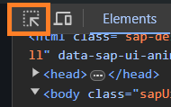
- You are now able to click on this icon to inspect the tooltip element
In the initialize script we wait the rendering of the Sliders elements to apply custom CSS classes in the _oTooltipContainer object.
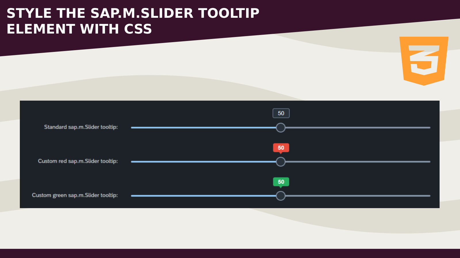
Here we can see the result:
- The JavaScript / CSS code can be improved and readapted for specific scenarios
- Other similar components can be inspected with the setTimeout/debugger trick
Hope this helps
Happy coding!